Let’s take a look at some old cards and give them a modern look! The hardest part about reading Yu-Gi-Oh! cards is the text box contains both game rules set, summoning text, and finally rules text. They aren’t always listed in that order on the card. Here’s a re-templating of Yu-Gi-Oh! cards in an attempt to make them more readable. This assumes some game rules are removed from the card and added to the game system.
Jinzo Example
Summoning Requirement Box: This card has a summoning requirement and they are listed in a box above the text box. This removes ambiguity between a cards cost and effect. Currently the game uses a ‘;’ notation. It’s clear but breaking it up two two paragraphs is easier to read.
Keywords: There are many effects that could be Keywords in the game to save reading time. Konami once argued that Keywords made that game more difficult for newcomers to understand. I understand that perspective in general but cards are simply to difficult to read quickly now. Condensing information make it easier to learn and build on top of.

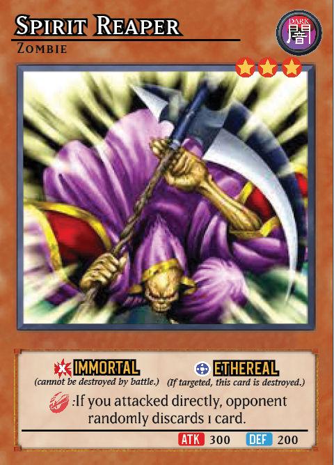
Spirit Reaper Example
Multi Keywords: Here’s one with more then one Keyword. Some cards might still be lists but it’s easy to identify the game effect now.
Timing Clauses: I used the sword symbol here as a marker of when this effect triggers. In this case, when it attacks. Modifying effects come after the effect timing symbol. This will help clear both timing questions and interaction timing questions.

Bigger Art Frame: The levels overlapping with the frame and moving the monster type to the top right corner open up more room for the artwork!
Would like Konami to bring in modern templating like this or do you prefer the way it is?